Category:
Work Project
Institution:
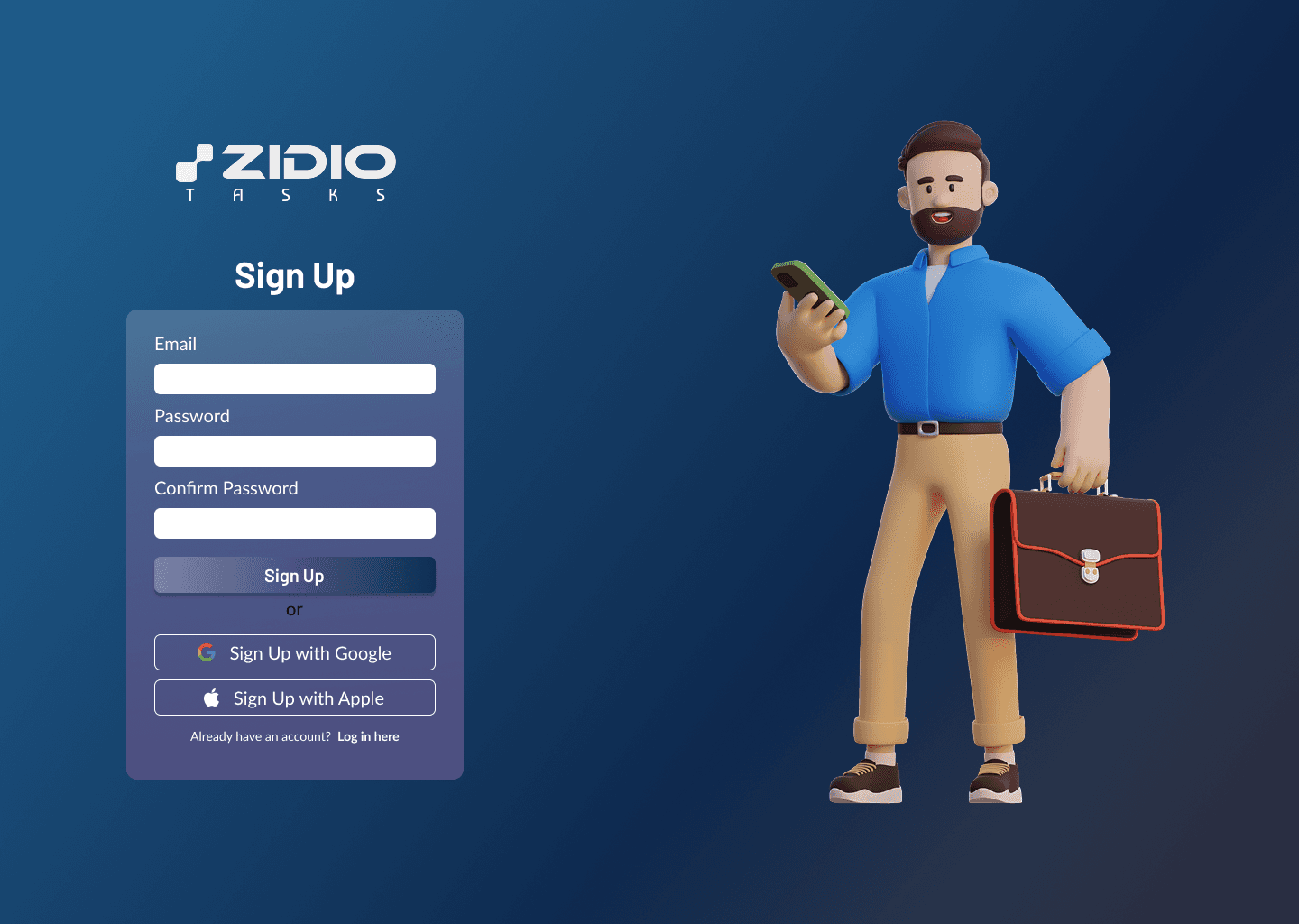


Designing Zidio Tasks - A Task Management System
Project Overview
Designing a three-perspective task management system as per the requirements of Zidio Development, with some beginner project management tools.
Features
The requirements provided by the company included the following features:
User-friendly interface with clear instructions, icons and understandable text. A simple and intuitive interface which makes navigation easy for all three perspectives
Integration with other tools like Google Sheets, Forms, Docs, Meet, etc.
Simple project management tools like calendar timelines, activity logs, etc. Kanban boards and Gantt charts are optional.
Comprehensive task management to help managers upload, create and assign tasks and subtasks with the option of uploading documents and files.
Minimal gamification elements to increase productivity and engagement among users, but not too much to discourage users from using the system.
Deliverables
The following deliverables were to be submitted to the company:
User Personas, Competitive Analysis, Moscow Analysis
High-Fidelity Mockups of primary interfaces
Interactive prototype demonstrating core functionality
Design System including typography, colour palette and component library
Competitive Analysis
A comprehensive competitive analysis was conducted among five different platforms, including the existing task management systems Choir, Zoho Projects, SmartSheet, Asana, and Clickup. I was tasked with conducting the research for Zoho Projects. For this project, a separate UI and UX analysis was conducted to help focus more thoroughly on all aspects of the task management system.
Category | Analysis Point | |
UI - Visual Design | Colour Schemes & Contrast | -Light theme -Shades of blue used |
Typography | -Bigger, brighter fonts enhance readability | |
Iconography | -Standard Zoho-style icons—functional, but somewhat generic | |
Visual Branding | - Consistent with the Zoho ecosystem - themes improved in v5X | |
Visual Hierarchy and Spacing | - Dashboard redesigned for clarity - Some elements are messy | |
UI - Layout and Composition | Grid Systems and Alignment | Logical layout, collapsible sidebar, customizable dashboard |
Whitespace and Content Density | Cleaner look in v5X, but lots of features can make pages feel cluttered | |
Balance of UI Elements | Good balance, but power features can overwhelm users | |
Responsive Layout | - Desktop-focused - mobile lacks parity | |
UI - Interactivity | Button Styles | Drag‑and‑drop UX (boards, Gantt) is solid |
Interactive Controls | Advanced controls (drag/drop, templates) but some hard to locate | |
UI - Consistency | Design Patterns and Component Reuse | Consistent Zoho patterns, though menu placements can vary |
Style and Interaction Uniformity | - Standard - UI updates are smooth, no flashy animations | |
UX - Task Flow | Ease of Completing Tasks | - Powerful task breakdown and time tracking - Task creation and bulk edits are sluggish |
Task Steps and Efficiency | Multiple clicks needed (e.g., task creation, status config) | |
UX - Navigation | Menu clarity & structure | Logical grouping, but menu labels/IDs can be confusing |
Information architecture | Follows a modular structure: each project has its own nested components | |
Search & filter functionality | Offers Zia-powered smart search. - Filtering is available, but basic - Task filters lack more advanced conditional logic. | |
UX – Onboarding | First-time experience & guides | - Tooltips & guides exist, but are not prominent - knowledge base essential |
Empty states with guidance | Dashboard offers custom widgets and templates | |
UX – Accessibility | Keyboard & screen reader support | - Not widely reported - General UI updates haven’t emphasised screen-readers |
Colour contrast, alt text, font size | - Visual contrast improved - no explicit alt-text info | |
UX – Feedback | Clear errors & confirmations | - Error flows are not highlighted - Deep menus confuse users |
Preventing/recovering from errors | -Not available | |
Customization options | Themes, templates, custom fields (Enterprise) & Blueprint workflows | |
Undo/redo support | Not mentioned—likely limited functionality | |
UX – Emotional Impact | Delightful interactions | Minimal delight—focus on functionality over visualisation |
Tone of voice | - Neutral, professional, and instructional. - Copy focuses on clarity rather than personality - Lacks emotional warmth or brand voice distinctiveness. | |
UX – Support | In-app help, support links, FAQs | Good help centre, community, chat/email support; no phone support |
UX – Real Use Performance | Task speed, time-to-completion | Stable core features, occasional slowdowns. |
User Personas
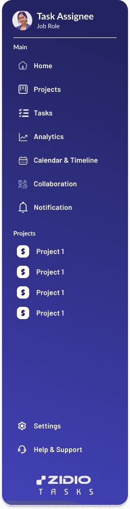
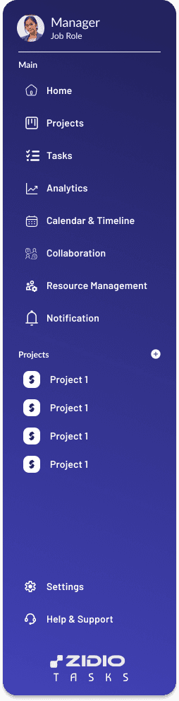
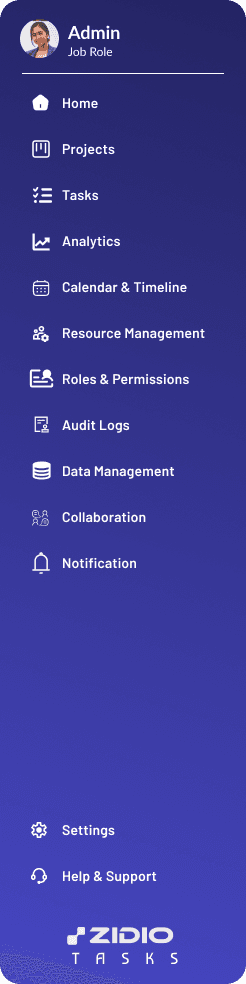
The task management system was to be designed in three different perspectives: Task Assignee, Manager and Platform Administrator. The team was asked to create three different imaginary personas representing a junior staff member as a task assignee and one each for the manager and platform administrator. I contributed to creating the user persona for the manager.
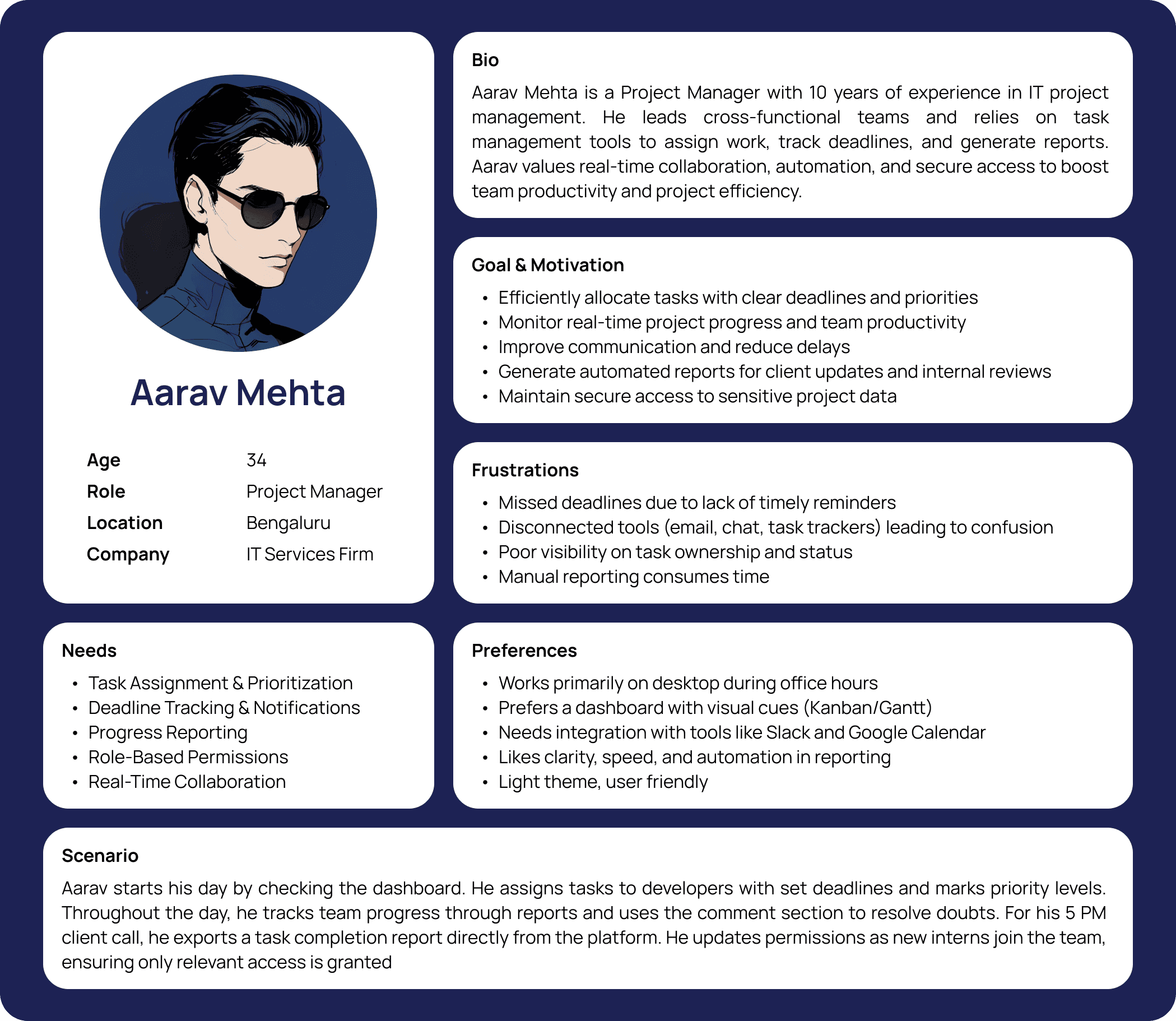
(Source: Jay Rupareliya)


(Source: Arun Reddy)
Colour Palette
The colour palette for Zidio Tasks is predominantly different shades and tints of blue, arranged in a single gradient. The first colour is used for primary cards, the second for background colour, the third for secondary cards and the last for the navigation bar.

Call to Action (CTA)

Typography

User Characters/Avatars
There are three user characters for each user perspective: task assignee, manager, and platform administrator.

Design System

Component Library
 |  |  |
 |  |  |


MOSCOW Analysis
Based on the user personas and the competitive analysis, the team was tasked to create a MOSCOW Analysis as follows:

(Source: Jay Rupareliya and Rajveer Singh Thakur)